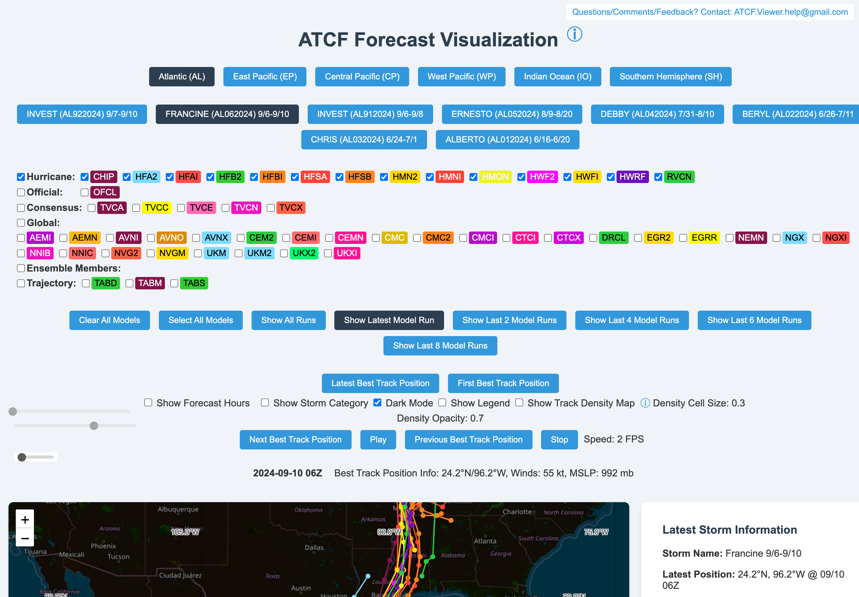
Navigate the complexities of storm forecasting with the ATCF Forecast Visualization tool. This advanced platform offers a detailed look at potential storm paths by visualizing the density of forecasted storm positions across various models and run times.
Key Features:
All-Model Inclusion:
Seamlessly integrates data from all available models, ensuring a holistic view of storm predictions. Extended Time Range:
Provides forecasts up to 120 hours (5 days) into the future, giving you ample time to prepare. Recent Runs Emphasis:
Utilizes the most recent model runs from the past 12 hours to ensure the information is as current as possible. Color Intensity Indicator:
Employs a color-coding system where darker shades represent higher concentrations of forecasted positions. How It Works:
The map is segmented into a grid of cells, each counting the number of forecast points within it. Cells are then shaded from light to dark blue, corresponding to the density of points, indicating areas of higher model agreement. Interpretation:
Darker areas on the map suggest a higher likelihood of the storm following that path, but it's important to note: Storms can still form in less dense areas. The map does not predict the timing or intensity of the storm. It should be used in conjunction with individual model forecasts and official advisories. Cell Size Adjustment:
Adjusting cell size helps balance detail and clarity: Smaller cells: Offer a more detailed view but may take longer to render. Larger cells: Provide a quicker, broader overview of trends but with less precision. Conclusion: The ATCF Forecast Visualization tool is designed to offer a quick, visual summary of forecast agreement and uncertainty in storm track predictions. Visit https://atcf-model-track-viewer.replit.app/ to enhance your understanding of storm patterns and make more informed decisions.
